Why WordPress Blocks with React?
Before discussing How to build custom WordPress Blocks with React, let's start by talking about why you should build WordPress Blocks with React.
function space_rocket_blocks_categories( $categories, $post ) {
    return array_merge(
        $categories,
        array(
            array(
                'slug' => 'space-rocket-blocks',
                'title' => __( 'Space Rocket Blocks', 'space-rocket-blocks' ),
                'icon'  => 'wordpress',
            ),
        )
    );
}
add_filter( 'block_categories', 'space_rocket_blocks_categories', 10, 2 );
On December 6th, 2018, the WordPress CMS changed forever with the release of WordPress 5.0. The old editor was replaced from looking this:
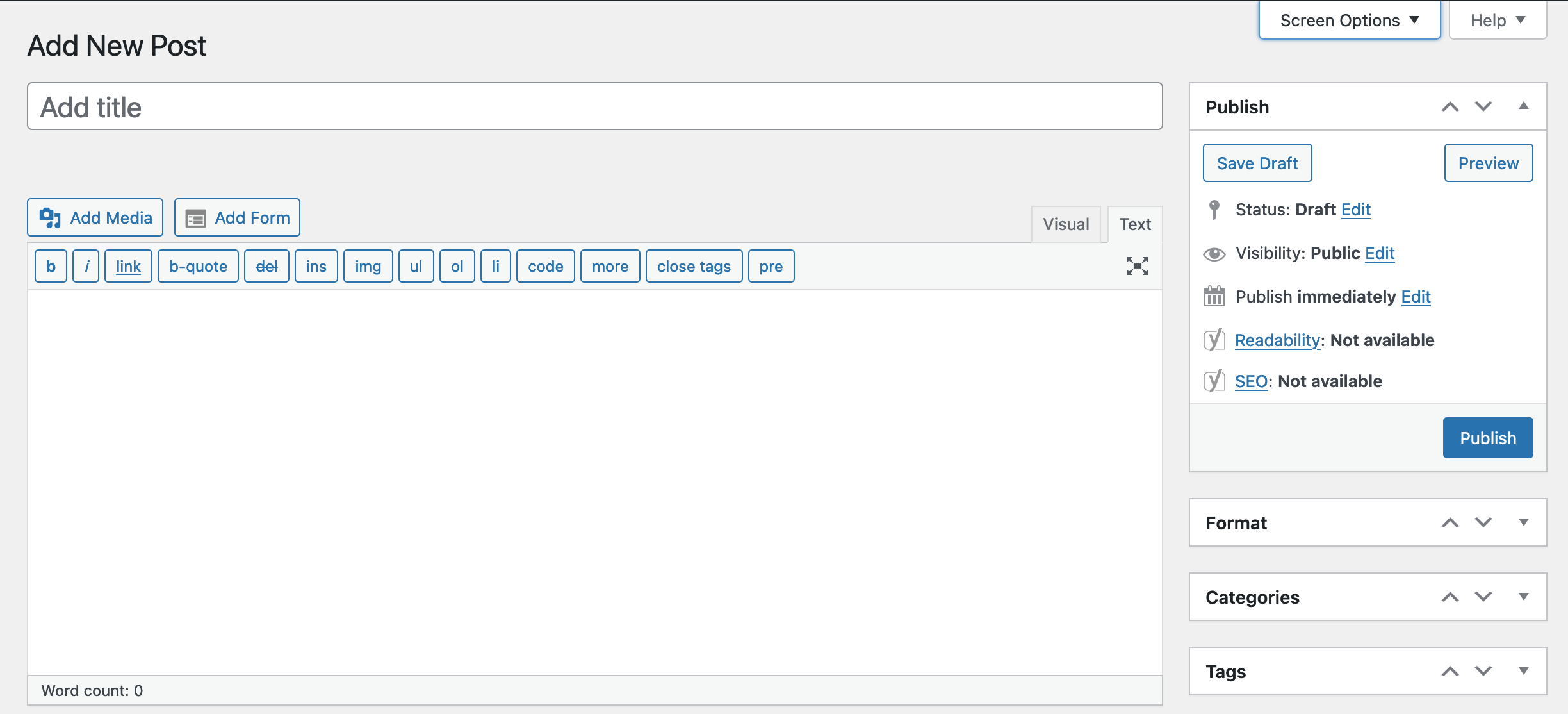
Screenshot of WordPress Post Editor before WordPress Block Editor
To the new WordPress Block Editor, previously code-named "Gutenberg," that looks like this: Screenshot of the new WordPress Block Editor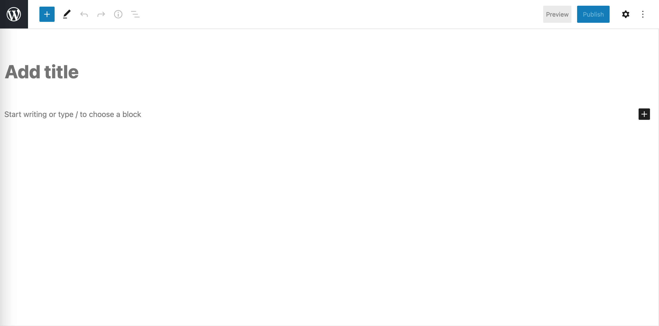
The goal of the WordPress Block Editor is to make WordPress more of a website builder that out-competes Webflow, Wix, and friends while taking a leap in the technology stack with the use of React.js instead of PHP.
WordPress blocks allow developers to code seamless back-end interfaces that match the front-end design, with all content editable. A web designer can design a set of components to be developed into blocks that can be reused to build sites and pages.
This article will show you the best practice as of 2021 on how to build a custom WordPress block library.
Because every website needs a hero, our first block will be a "Hero" Block.
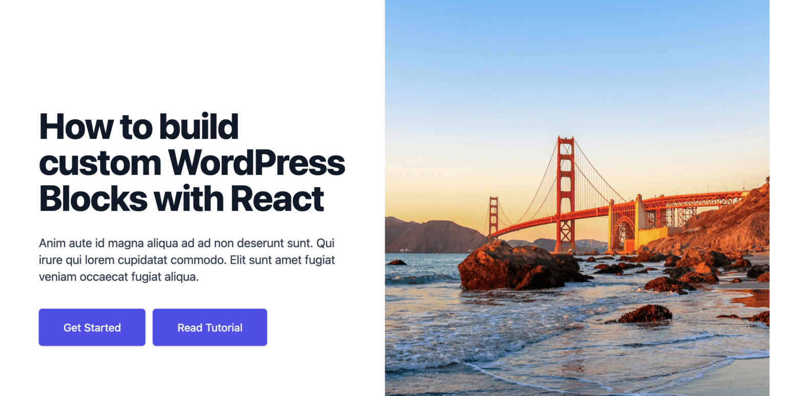
Our finished block will look like this: Finished custom WordPress Block built with React.js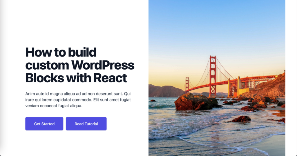
WordPress admin's back-end interface will look exactly the same as it does on the front-end but with all content editable. Since we have full control of the backend UI and get to use React, the sky is the limit!
Our Hero WordPress block made with React.js is going to consist of these elements:
- headingContent
- textContent
- buttons
- featuredImageID
- featuredImageURL
Let's get started
Create a plugin
First step is to create a plugin for our custom WordPress Block. Let's name it space-rocket-blocks. Create a directory called space-rocket-blocks and cd into it. Inside the space-rocket-blocks directory, create a file named index.php, with below as its contents.
/**
 * Plugin Name:       Space-Rocket Blocks
 * Description:       Space-Rocket Blocks Library
 * Requires at least: 5.7
 * Requires PHP:      7.0
 * Version:           0.1.0
 * Author:            Space-Rocket
 * License:           GPL-2.0-or-later
 * License URI:       https://www.gnu.org/licenses/gpl-2.0.html
 * Text Domain:       space-rocket-blocks
 *
 * @package           space-rocket-block
 */

require_once __DIR__ . '/hero/index.php';
Generate block using @wordpress/create-block
From inside the space-rocket plugin directory
npx @wordpress/create-block hero --namespace space-rocket-blocks --title "Hero" --short-description="For when you need a hero" --category space-rocket-blocks
How to register multiple custom WordPress Blocks in one plugin
We want to create a custom WordPress Block library. To do that, we will need to register multiple custom WordPress Blocks.
Rename hero/hero.php to hero/index.php and remove the auto-generated plugin details since Hero will be part of the space-rocket-blocks plugin. hero/index.php should now look like this:
/**
 * Registers the block using the metadata loaded from the `block.json` file.
 * Behind the scenes, it registers also all assets so they can be enqueued
 * through the block editor in the corresponding context.
 *
 * @see https://developer.wordpress.org/reference/functions/register_block_type_from_metadata/
 */
function space_rocket_blocks_hero_block_init() {
    register_block_type_from_metadata( __DIR__ );
}
add_action( 'init', 'space_rocket_blocks_hero_block_init' );
We already added require_once __DIR__ . '/hero/index.php'; to the space-rocket-blocks plugin file. To add additional custom WordPress Blocks, we would run npx @wordpress/create-block command and repeat the steps.
Now activate the space-rocket-blocks plugin through the WordPress dashboard plugins page.

Activating custom WordPress Block built with React
Add custom category
WordPress blocks are organized by categories:
- text
- media
- design
- widgets
- theme
- embed
We want to organize our blocks by their own category, "Space Rocket Blocks." To do that, add the code below to the space-rocket-blocks/index.php file.
function space_rocket_blocks_categories( $categories, $post ) {
    return array_merge(
        $categories,
        array(
            array(
                'slug' => 'space-rocket-blocks',
                'title' => __( 'Space Rocket Blocks', 'space-rocket-blocks' ),
                'icon'  => 'wordpress',
            ),
        )
    );
}
add_filter( 'block_categories', 'space_rocket_blocks_categories', 10, 2 );
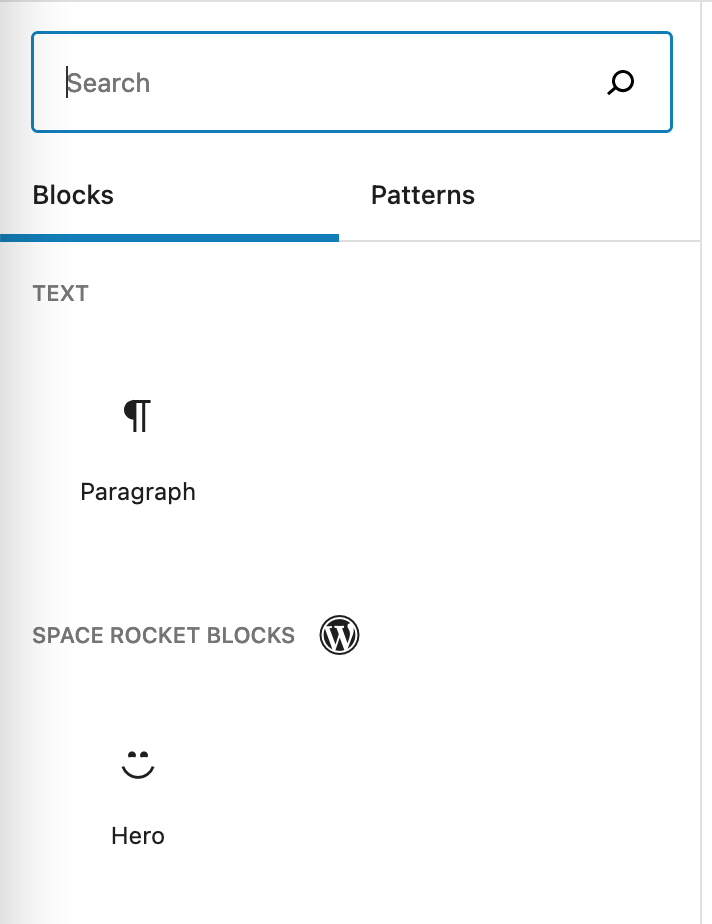
Adding a custom WordPress block category
Remove default WordPress blocks
WordPress Block Editor comes with a plethora of default blocks. Let's remove them all except for the paragraph block to have a fresh start without any bloat. Add the below code to the space-rocket-blocks/index.php file.
function space_rocket_blocks_allowed_block_types( $allowed_block_types, $post ) {
    return array( 'core/paragraph', 'space-rocket-blocks/hero' );
}

add_filter( 'allowed_block_types', 'space_rocket_blocks_allowed_block_types', 10, 2 );
Add Tailwinds CSS library
Next, we want to add the Tailwind CSS library to easily and consistently style our Hero custom WordPress Block.
To get started, will install the dependencies by running this command from within the space-rocket-blocks/hero directory:
npm install -D tailwindcss@latest postcss@latest autoprefixer@latest
Next, we need to add postcss.config.js file with the below contents.
module.exports = {
  plugins: {
    tailwindcss: {},
    autoprefixer: {},
  }
}
Now we run the npx tailwindcss init command to create a tailwind.config.js file.
npx tailwindcss init
module.exports = {
  purge: [],
  darkMode: false, // or 'media' or 'class'
  theme: {
    extend: {},
  },
  variants: {},
  plugins: [],
}
Later, we can add our Tailwind CSS options and configurations to this file.
Now we need to update our hero/src/style.scss file to include the Tailwind imports.
@tailwind base;
@tailwind components;

// Put your styles here...
.wp-block-space-rocket-blocks-hero {
  @apply bg-pink-500;
  border: 1px dotted #f00;
}

@tailwind utilities;
.wp-block-create-block-hero {

}
and then add to editor.scss to show that it's working in there too:
.wp-block-space-rocket-blocks-hero {
  @apply bg-pink-500;
  border: 1px dotted #f00;
}
We added @apply bg-pink-500; to the file to test that Tailwind CSS is indeed working.
Unset width from editor
The WordPress Block Editor has some pesky defaults. Let's remove the set max-width of the .wp-block.
.wp-block {
  max-width: unset;
}
Test it out
npm run build
Ensure that our Space-Rocket Blocks plugin is activated and create a new post and select a block. Our block should look like this: Adding Tailwind CSS to Custom WordPress Block built with React.js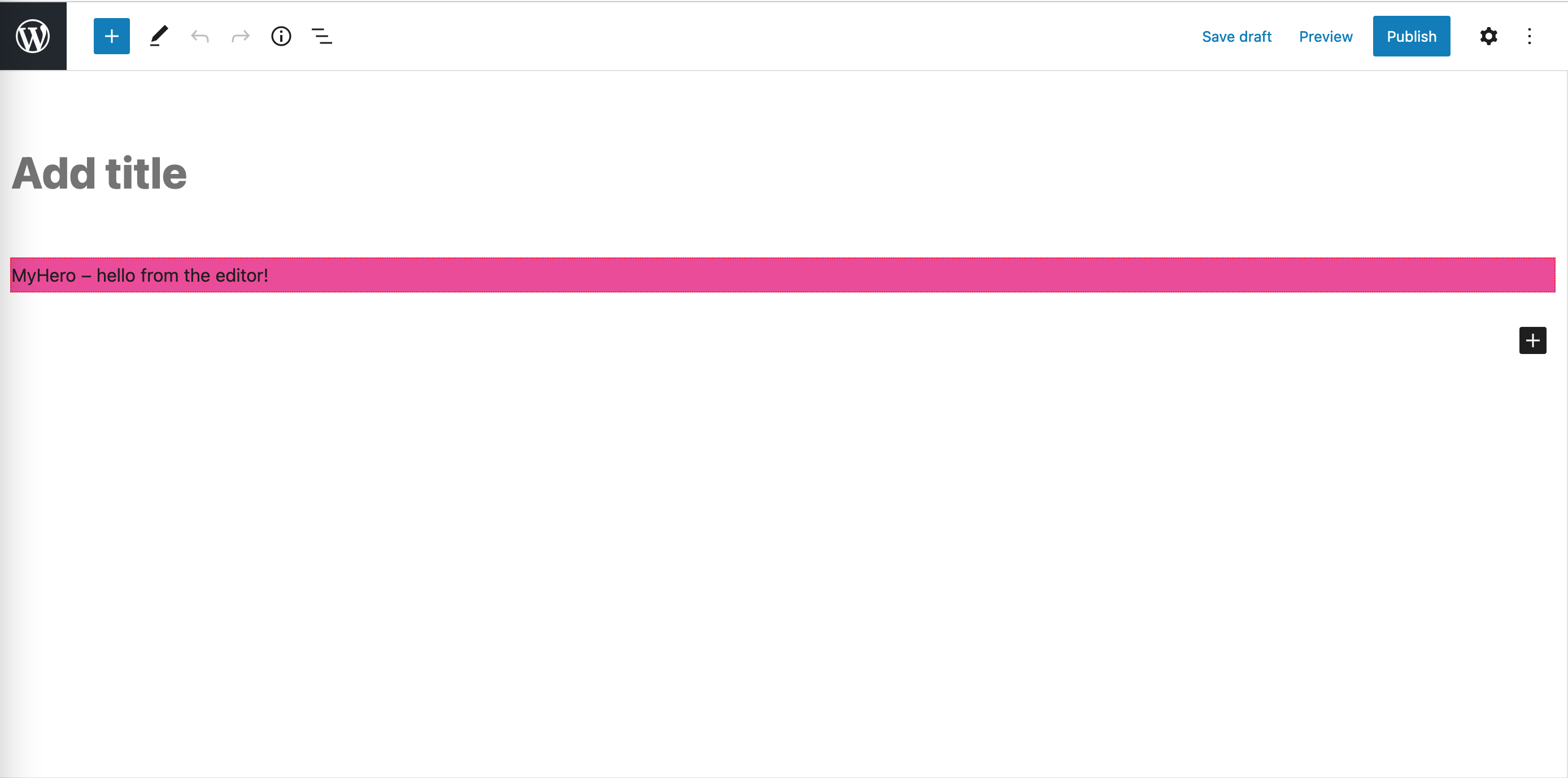
Don't worry; we will add static HTML markup and CSS styles to make things look nice in the next step.
Add markup
Let's add the static HTML markup to our custom WordPress Block.
export default function Edit() {
  return (
    <div { ...useBlockProps() }>
      <div className="hero container">
          <div className="content-inner">
              <div className="content">
                <h2>How to build custom WordPress Blocks</h2>
                <p>Anim aute id magna aliqua ad ad non deserunt sunt. Qui irure qui lorem cupidatat commodo. Elit sunt amet fugiat veniam occaecat fugiat aliqua.</p>
                <div className="btn-group relative">
                    <div className="btn-primary">
                        <a className="btn-text" href="#">Get Started</a>
                    </div>
                    <div className="btn-primary">
                        <a className="btn-text" href="#">Read Tutorial</a>
                    </div>
                </div>
              </div>
              <div className="featured">
                  <img className="featured-image" alt="Marshall's Beach, San Francisco, United States by Natalie Chaneye" title="Marshall's Beach, San Francisco, United States by Natalie Chaney" src="https://source.unsplash.com/KQVX1_pYpsA/1600x900"/>
              </div>
          </div>
      </div>
    </div>
  );
}
With the new WordPress Block Editor, we are able to have our front-end and backend markup be the same. The useBlockProps.save() returns the saved attributes from hero/src/edit.js [https://developer.wordpress.org/block-editor/reference-guides/block-api/block-edit-save/#save]
export default function save() {
    return (
        <div { ...useBlockProps.save() }>
            <div className="hero container">
                <div className="content-inner">
                    <div className="content">
                        <h2>How to build custom React Gutenberg Blocks</h2>
                        <p>Anim aute id magna aliqua ad ad non deserunt sunt. Qui irure qui lorem cupidatat commodo. Elit sunt amet fugiat veniam occaecat fugiat aliqua.</p>
                        <div className="btn-group relative">
                            <div className="btn-primary">
                                <a className="btn-text" href="#">Get Started</a>
                            </div>
                            <div className="btn-primary">
                                <a className="btn-text" href="#">Read Tutorial</a>
                            </div>
                        </div>
                    </div>
                    <div className="featured">
                        <img className="featured-image" alt="Marshall's Beach, San Francisco, United States by Natalie Chaneye" title="Marshall's Beach, San Francisco, United States by Natalie Chaney" src="https://source.unsplash.com/KQVX1_pYpsA/1600x900"/>
                    </div>
                </div>
            </div>
        </div>
    );
}
Update CSS
All the Hero custom WordPress Block styles will be encapsulated by being nested inside the .hero.container selector.
@tailwind base;
@tailwind components;
.wp-block-create-block-hero {
    position: relative;
}
.hero.container {
  @apply lg:relative mx-auto;
  .content-inner {
    @apply px-4 lg:w-1/2 sm:px-8 xl:pr-16;
  }
  .row {
    @apply mx-auto max-w-7xl w-full pt-16 pb-20 text-center lg:py-48 lg:text-left;
  }
  .title {
    @apply text-4xl tracking-tight font-extrabold text-gray-900 sm:text-5xl md:text-6xl lg:text-5xl xl:text-6xl;
  }
  .featured {
    @apply relative w-full h-64 sm:h-72 md:h-72 lg:absolute lg:inset-y-0 lg:right-0 lg:w-1/2 lg:h-full;
  }
  .featured-image {
    @apply absolute inset-0 w-full h-full object-cover m-0;
  }
  .btn-group {
    @apply mt-10 sm:flex sm:justify-center lg:justify-start;
  }
  .btn-primary {
    @apply rounded-md shadow;
    @apply bg-indigo-600 hover:bg-indigo-700 text-white;
  }
  .btn-primary:not(:nth-of-type(1)) {
    @apply mt-3 rounded-md shadow sm:mt-0 sm:ml-3;
  }
  .btn-primary a {
    @apply w-full flex items-center justify-center;
    @apply border border-transparent rounded-md;
    @apply px-8 md:px-10 py-3 md:py-4;
    @apply text-base font-medium md:text-lg text-gray-100 no-underline;
  }
}
.content {
  @apply mx-auto max-w-7xl w-full pt-16 pb-20 text-center lg:py-48 lg:text-left;
}

@tailwind utilities;
Run Our custom Hero WordPress Block looking like this.npm run build from inside the hero directory and re-create a block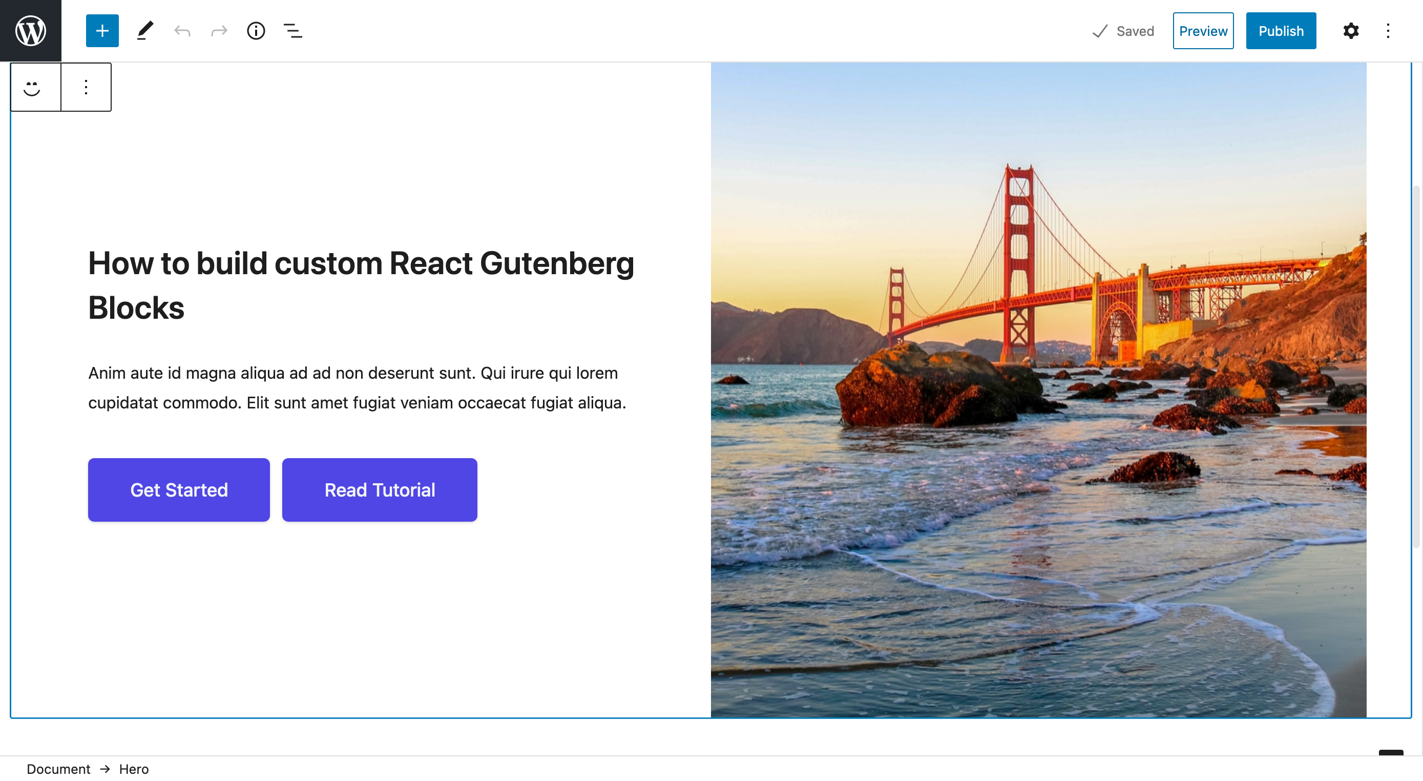
Add RichText fields<
All that is left is to make it dynamic so that it can be updated by a non-coder.
First, add attributes to the hero/block.json file.
{
  "attributes": {
    "headingContent": {
      "type": "string",
      "source": "text",
      "selector": "h1",
      "default": "How to build custom React Gutenberg Blocks"
    },
    "textContent": {
      "type": "string",
      "source": "text",
      "selector": "p",
      "default": "Anim aute id magna aliqua ad ad non deserunt sunt. Qui irure qui lorem cupidatat commodo. Elit sunt amet fugiat veniam occaecat fugiat aliqua."
    },
  },
}
Then import attributes into index.js
...
import metadata from '../block.json';

const { attributes } = metadata;

registerBlockType( 'space-rocket-blocks/hero', {
    attributes
    ...
} );
...
import { useBlockProps, RichText } from '@wordpress/block-editor';
...
export default function Edit({attributes, setAttributes}) {
  return (
    <div { ...useBlockProps() }>
        ...
                    <div className="content">
                        <RichText
                            className="title"
                            tagName="h2"
                            value={ attributes.headingContent }
                            onChange={(val) => setAttributes({headingContent: val})}
                        />
                        <RichText
                            tagName="p"
                            value={ attributes.textContent }
                            onChange={(val) => setAttributes({textContent: val})}
                        />

                    </div>
        ...
  );
}
Using ...useBlockProps.save() renders HTML as sanitized content, meaning that it will render HTML verbatim, including the HTML tags, ex: <code class="language"><h1>Hello World</h1></code>. Therefor, we need to use <code class="language"><RichText.Content tagName="p" value={ someAttrVal } /></code>, which we can use safely without opening ourselves to cross site scripting.
...
export default function save({attributes}) {
    const { headingContent} = attributes;

    return (
        <div { ...useBlockProps.save() }>
                    ...
                        <RichText.Content className="title" tagName="h2" value={ headingContent } />
                        <RichText.Content tagName="p" value={ textContent } />

                    ...
        </div>
  );
}
Add Dynamic Buttons to custom WordPress Block
We want to add, edit and remove buttons with no more than two buttons being able to be added. To be able to do this, will need a repeatable field that contains our button, which is actually an ahref tag. Our buttons element will be a list of containing 'ahref' links.
Add button attributes to hero/block.json
Let's start composing our Buttons element by assigning its attributes and some default values.
{
  ...
  "attributes": {
    ...
    "buttons": {
      "type": "array",
      "default": [
        {
          "text": "<a href=\"#\">Get Started</a>"
        },
        {
          "text": "<a href=\"#\">Read Tutorial</a>"
        }
      ]
    }
  },
  ...
}
Add button fields and functions.
...
import { IconButton  } from '@wordpress/components';
...
export default function Edit({attributes, setAttributes}) {
    let buttonFields, addButton

    if ( attributes.buttons.length ) {
        buttonFields = attributes.buttons.map( ( button, index ) => {
            return <Fragment key={ index }>
                <RichText
                    className="btn-primary"
                    value={ button.text }
                    onChange={ (text) => handleButtonChange(text, index) }
                />
                <IconButton
                    className="sr__remove-button-text "
                    icon="minus"
                    label="Delete button"
                    onClick={ () => handleRemoveButton( index ) }
                />
            </Fragment>;
        } );
    }

    if ( attributes.buttons.length > 1 ) {
        addButton = '';
    } else {
        addButton = <IconButton
            isDefault
            className="sr__add-button-text "
            icon="plus"
            label="Add button"
            onClick={ () => handleAddButton() }
        />;
    }
    const handleAddButton = () => {
        const buttons = [ ...attributes.buttons ];
        buttons.push( {
            text: '',
        } );
        setAttributes( { buttons } );
    };
    const handleRemoveButton = ( index ) => {
        const buttons = [ ...attributes.buttons ];
        buttons.splice( index, 1 );
        setAttributes( { buttons } );
    };
    const handleButtonChange = ( text, index ) => {
        const buttons = [ ...attributes.buttons ];
        buttons[ index ].text = text;
        setAttributes( { buttons } );
    };

  return (
    <div { ...useBlockProps() }>
                    ...
                        <div className="btn-group">
                            { buttonFields }
                            {addButton}
                        </div>
                    ...
    </div>
  );
}
Now, update save.js with to use the dynamic buttons
...
export default function save({attributes}) {
    const { headingContent, textContent, buttons} = attributes;

    const buttonFields = buttons.map( ( button, index ) => {
        return <div key={ index } className="btn-primary">
            <RichText.Content className="btn-text" value={ button.text } />
        </div>;
    });

    return (
        <div { ...useBlockProps.save() }>
                    ...
                        <div className="btn-group relative">
                            { buttonFields }
                        </div>
                    ...
        </div>
  );
}
Add dynamic image
add attributes
{
  ...
  "attributes": {
    ...
    "featuredImageID": {
      "type": "number"
    },
    "featuredImageURL": {
      "type": "string",
      "source": "attribute",
      "selector": "img",
      "attribute": "src"
    }
  },
  ...
}
...
export default function Edit({attributes, setAttributes}) {
    ...

    const onSelectFeaturedImage = function( featuredImage ) {
        return setAttributes( {
            featuredImage,
            featuredImageURL: featuredImage.url,
            featuredImageID: featuredImage.id
        } );
    };
  ...
  return (
    <div { ...useBlockProps() }>
                    ...
                    <MediaUpload
                        label={__('FeaturedImage', 'hero')}
                        onSelect={onSelectFeaturedImage}
                        allowedTypes={'image'}
                        value={ attributes.featuredImageID }
                        render={({open}) => (
                            ! attributes.featuredImageID ?
                                <div className="featured bg-gray-100">
                                    <Button className="absolute top-1/2 left-0 right-0 mx-auto btn-primary" onClick={open}>Open Media Library</Button>
                                </div> :
                                <div className="featured bg-gray-100">
                                    <img className="featured-image" src={attributes.featuredImageURL} />
                                    <Button className="absolute top-1/2 left-0 right-0 mx-auto btn-primary bg-pink-500" onClick={open}>Open Media Library</Button>
                                </div>
                        )}
                    />
                    ...
    </div>
  );
}
Update save.js
...
export default function save({attributes}) {
    const { headingContent, textContent, buttons, featuredImage} = attributes;
    ...
    return (
        <div { ...useBlockProps.save() }>
                  ...
                    <div className="featured">
                        <img className="featured-image" alt={featuredImage.alt} title={featuredImage.title} src={featuredImage.url} />
                    </div>
                  ...
        </div>
  );
}
Add CSS style to override blocks styles from WordPress core
.featured {
  .components-button {
    margin: 0 auto;
  }
}
Conclusion
We have achieved our goal of having a custom-designed block and converting it to a fully dynamic custom WordPress Block using React.js. You can find the completed implementation on my Github at https://github.com/space-rocket/space-rocket-blocks. We have only scratched the surface. We can add to the Toolbar if the headingText is selected to allow the user to choose the heading h1,h2,h3,h4 or when the user selects the image, have controls to crop, align center, or cover. We will have to cover that another day!
Launch Your Project
Get your project off the ground
with Space-Rocket!
Fill out the form below to get started.


